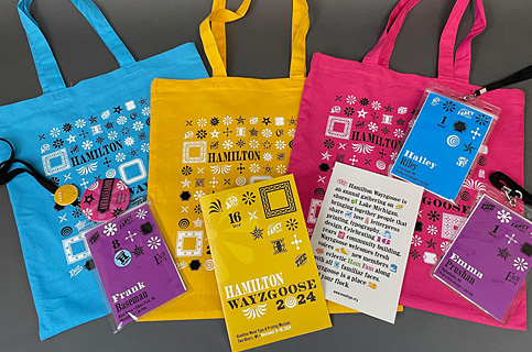
Hamilton Wayzgoose 2024 Brand Identity Design System
When I received the email from Hamilton Wood Type & Printing Museum inviting me to design the brand identity for the Hamilton Wayzgoose 2024 I was initially stunned—and then flattered to be asked. I had recently offered to volunteer more with the Museum, so careful what you wish for—as I was about to be in for one very large volunteer endeavor!
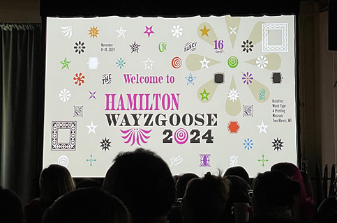
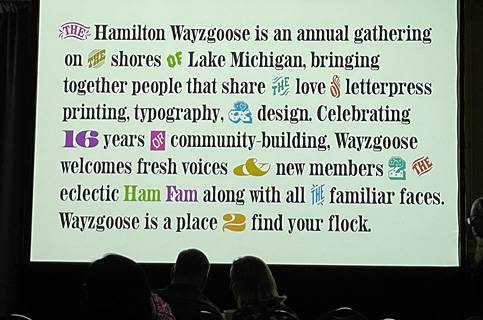
I have attended the past seven Wayzgooses (or “Wayzgeese” is how I have come to call multiple Wayzgooses)—including the two that were virtual—so I was already familiar with the kind of project this was. And then when I replied in the affirmative to take the project on, my instincts kicked in and said “holy moley!,” what did I just do? Knowing that there would be some very discerning eyes in the audience (many of whom I know personally) we rose to the challenge, took the project on and started to get to work.

For design assistance, I reached out to two of my students, the lovely and talented Emma Prushan and Hailey Riley, both rising seniors in the Visual Communication Design program at Thomas Jefferson University (my day job). We have had several classes together so far during their collegiate education and I knew that I could count on these talented young designers, so we formed a team with me taking the design lead.
For information gathering and research on this project, I leaned in on my personal “experiential research,” that of having been an attendee of the ‘Goose for several years; my recent eight years of becoming a letterpress printer; and my numerous years as a graphic designer.
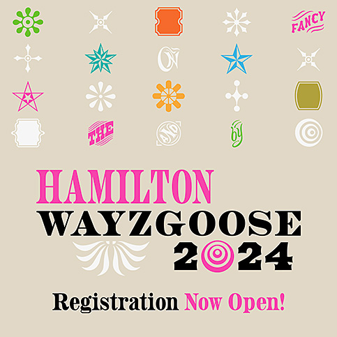
I started with sketching and very extensive type studies, deciding to embrace the “limitation” of using only Adobe HWT fonts (of which there are quite a few) for the project rather than being faced with the bazillions and bazillions of fonts and typefaces available today digitally. I designed a “type treatment” rather than a “logo” per se, ultimately settling on using Aetna Regular and Aetna Condensed with ornaments as “whiskers” and a “googly.”
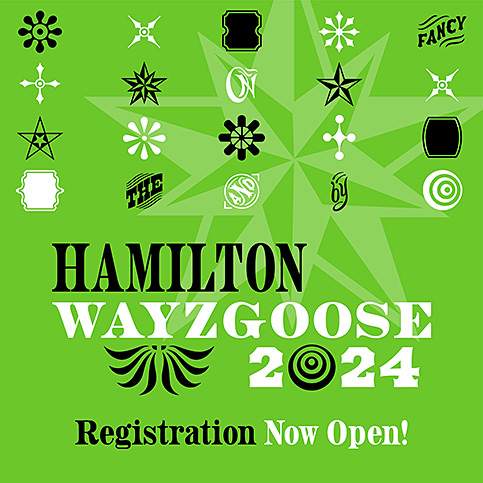
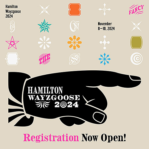
In my own work I have oftentimes gravitated towards printer’s ornaments, “dingbats,” “gee-gaws,”—whatever you choose to call them. While I do have my preferences (as we all no doubt do), as a designer and printer I don’t think I’ve ever met a type ornament I didn’t like. In the end, I’d say our design approach was to “amplify” the sometimes overlooked type ornament. So, I started playing with patterns of ornaments made with bits and pieces of HWT Star Ornaments, HWT Catchwords and HWT Borders.
From the get-go we wanted to provide some variety in the overall design system so that pieces were not exactly the same, though still held together cohesively across multiple media. I have attended many design conferences in my day where the overall branding—the identity, the color palette, brand elements, etc. —is exactly the same on all of the pieces. For this project we wanted to do something a bit different, to allow for some flexibility and variety of uses in the “kit of parts”/the design system that we came up with. For instance, the ornament usage and patterns change around; we provided a color palette with a variety of bright background colors that are used within the design system; and instead of one standard tote bag color, we opted for three different bag colors.
In the end, we hope that we have provided an overall design system that is fun, engaging and of course, appropriate to the eclectic and welcoming atmosphere that Wayzgoose is all about.
