Artist/Designer/Printer-in-Residence at Tipoteca Italiana Fondazione
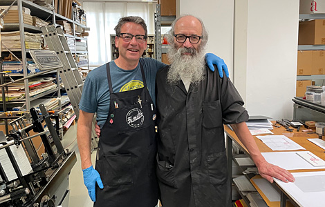
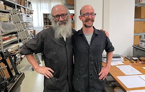
During June of 2022 I was very fortunate to be able to do an Artist/Designer/Printer-in-Residency at the fabulous and magnificent typography and printing museum, Tipoteca Italiana Fondazione in Cornuda, Italy. Needless to say, this was an amazing experience and opportunity, as the type collection at Tipoteca alone is vast, beautiful, wonderfully cared for (most of the type is in mint condition)—and very, very special. Riffing off of the Artist/Designer/Printer-in-Residency I had done two summers ago at Hamilton Wood Type & Printing Museum, I had a sense of what I was in for. Still this experience was nothing if not unique.
I soon coined this experience a “printcation” © (cause y’all know how much I like nicknames). Also notice the copyright symbol; I may have invented this term, and if I did you may still “borrow” it, and use it, just please try to give credit where credit is due. A printcation is just what it sounds like: part vacation, part printing = all fun, all the time!
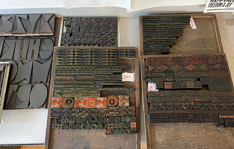
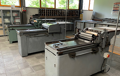
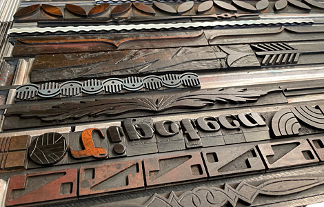
As usual and can be understood, I started by trying to get the big picture sense of the typographic landscape. Fortunately (and very wisely), Tipoteca had photographed each case (or drawer, though I know we’re not really supposed to use that word for a case of type …) in the collection, so my first steps were to look through many, many, many photos of type to just start to narrow down to the ones I might be interested in using. And since I had come all this way, I wasn’t interested in anything I could see or use back home (no “French Clarendons” for me here), and nothing too generic or plain (no plain Jane, anonymous Gothics or Grotesques). I wasn’t difficult at all to narrow down to a reasonable list of typefaces so that I could then go to the “stacks” and peruse the type in person. I scribbled quick notes in my small notebook, and I was good to go.
One early decision was to print large, at 50 x 70 centimeters, which is almost twice the size that I am normally used to printing back home (13 x 20 inches is my “normal” format). I decided to print large because A.) I had the opportunity to; B.) it would be a bit out of my comfort zone, and a key part of these “printcations” is to try new things.
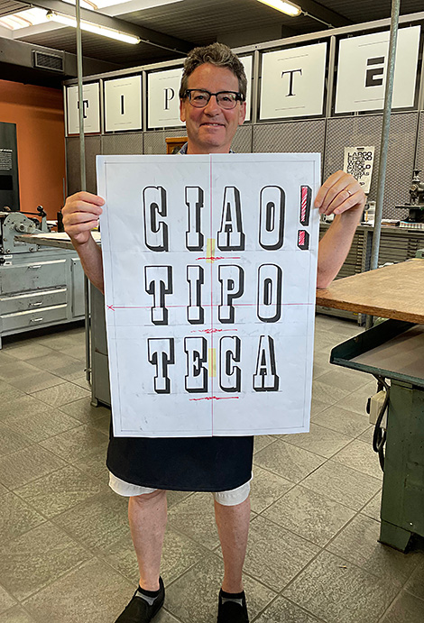
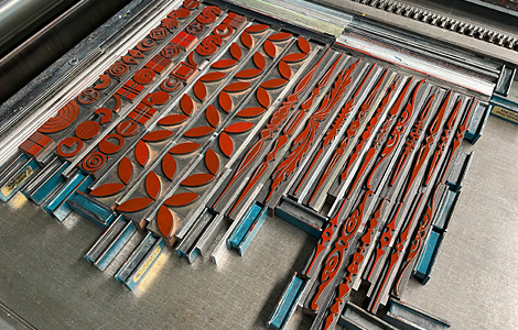
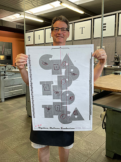
Once I pulled some type, images, ornaments, decorative rules and border treatments, I proofed the type on tracing paper (a technique that I picked up from the lovely and talented, Stephanie Carpenter from Hamilton). That way I could do good old-fashioned cut ‘n paste layouts of the prints I might be interested in executing. I was familiar with working this way from very early in my career, “way back in the day.”
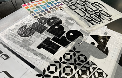
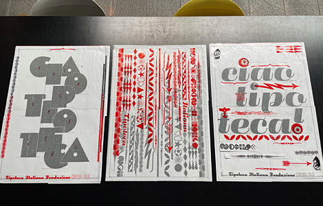
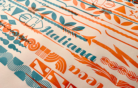
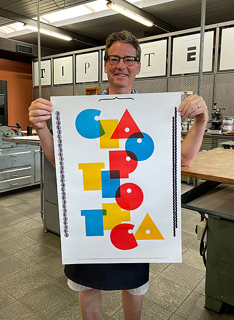
In the end I made four “Love Notes” to Tipoteca that I entitled Tipoteca Amore, numbers 1–4. My homage to this amazing institution. I donated half of the print run to Tipoteca for them to sell to raise funds to help to support the museum. I do hope that I get an opportunity to come back and visit again. Ciao Tipoteca!
Tipoteca Amore, no. 1. Made with Belgio / Independent typeface designed by G. Collette and J. Dufour, 1930; 30 ciceros (approx. 32 picas, or five inches); 4-color letterpress print.
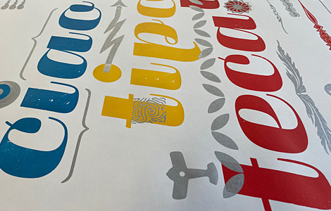
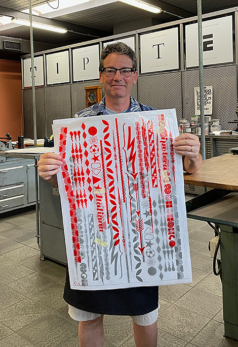
Tipoteca Amore, no. 2. Made with a bunch of ornaments, parts of borders, crazy gorgeous rules, and other bits & bobs; 3-color letterpress print.
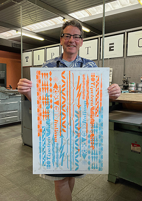
Tipoteca Amore, no. 3. Made with Fluidium typeface designed by Alessandro Butti, approx. 1937; 30 ciceros (approx. 32 picas, or five inches); 5-color letterpress print.
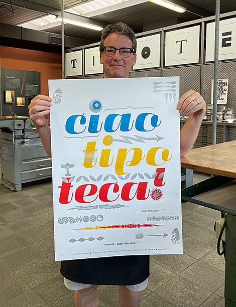
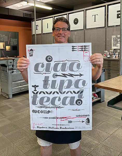
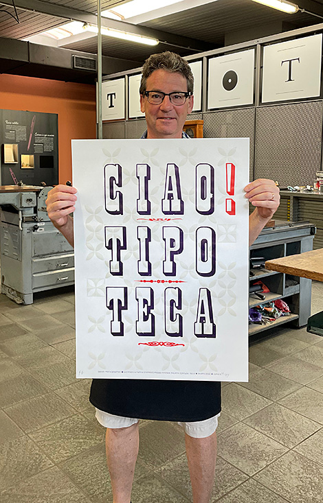
Tipoteca Amore, no. 4. Made with anonymous unnamed bold condensed outlined shaded slab serif typeface with pattern of lovely petal-shaped border ornaments; 3-color letterpress print.